Blambo Posted March 22, 2014 I get that y'all are mostly designer/writer/programmer types, but I need another venue to selfishly indulge in weird internet validation. I'm not sure if there already exists a thread for this, but if not let's post art of all kinds in this one! I guess it could be for critique, compliments, or simply something to look at in between coding stints. Right now I'm weening myself off of specialized brushes and fancy layer settings, and so far I'm developing arthritis: Share this post Link to post Share on other sites
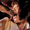
clyde Posted March 23, 2014 I have a narrative priority, so when I see this, it's the hands-up that I pay attention to. Share this post Link to post Share on other sites
clyde Posted March 27, 2014 http://doodle-plans.tumblr.com/image/80878965032 Share this post Link to post Share on other sites
chummer Posted March 27, 2014 http://doodle-plans.tumblr.com/image/80878965032 You thinking of making a music game, clyde? I've been designing one that focuses on using a pad instrument setup and explores hip hop. Share this post Link to post Share on other sites
clyde Posted March 27, 2014 You thinking of making a music game, clyde? I've been designing one that focuses on using a pad instrument setup and explores hip hop.I do think about making music-centric games frequently. Here I was struck by the amount of engagement I feel when listening to "Idle Moments" for the hundredth time. As I listen, I find myself visualizing character-movement. Duke Pearson's piano chords that come in around seven minutes are a massive pay-off for me. I'd like to figure out how to make those chords in games. So I was trying to draw inspiration from the organization of the form in a metaphorical way rather than in a direct way.In your game, will the player motive be making something that sounds good? Or have you devised a more objective rewards-system? That is a design problem I continually find myself trying to deal with as I fantasize about making music-centric games. Share this post Link to post Share on other sites
chummer Posted March 27, 2014 In your game, will the player motive be making something that sounds good? Or have you devised a more objective rewards-system? I'm leaning towards more objective-based gameplay, but I do want to include some creative flexibility. The neat thing about pad instruments is that you can load whatever sounds you want into them. Since the premise of the game is that players control a young girl exploring a world, they'll be able to collect sounds of different classes from various groups and customize the instrument. For instance she might run into some garbage men and she'd find a lid hit (snare), pail kick (bass drum), truck horn (sfx), etc. But I'm digressing from the topic! Both you and Blambo drew cool things. I really like how your piece looks like an illuminated manuscript, clyde. Was that what you were going for? Share this post Link to post Share on other sites
clyde Posted March 27, 2014 Your game sounds neat. I really like how your piece looks like an illuminated manuscript, clyde. Was that what you were going for? I have a very large quantity of similar material. I'm attracted to ink and watercolor with geometric compositions on paper so my stuff tends to look like like illuminated manuscripts or alchemical diagrams. I go through phases and the longer lasting ones tend to leave more of an impression. For a while I was obsessed with alchemical drawings, then perspective-views of cubical rooms with shelves, then early 20th century newspapers, then I got into golden rectangles, then stacks of things, then bottles... and so on. Mostly I'm interested in ways of organizing asunder items in ways that imply meaning. Share this post Link to post Share on other sites
aperson Posted March 27, 2014 I was going to say that your art looks a lot like the voynich manuscript. Share this post Link to post Share on other sites
CEJ Posted March 29, 2014 This might be the first time I've done a top-down perspective. It's not the first revision. I wouldn't show the first revision. Anyway, the game would be about pushing blocks around in dark dungeons and grisly catacombs. You'd probably use a cool shield bash to push the blocks. That would be cool. Share this post Link to post Share on other sites
}?pZ'o@8~4$b@!t? Posted March 29, 2014 Hi I'm new to the forum but thought might as well chime in. I draw primarily as a hobby but recently I become more interested in doing something for a game. At the moment I try to learn do draw digital with the drawing tablet I got last year. In the future I would like to learn animation techniques (If anyone knows good tutorials I would appreciate it.) Being self self taught I lack a grasp of perspective, composition and anatomy so I'm glad for advise. Here is my blog: http://iiiisiiii.tumblr.com/ Share this post Link to post Share on other sites
Blambo Posted March 30, 2014 Clyde that looks really awesome, like a kind of 14th century apothecary's journal. Simbiotik you have some amazingly strange, stylish stuff. It's got a lot of character (I know that's a statement that's used as a sort of soft, non-compliment but I genuinely like it aesthetically). Here's a mockup I've been doing: I think it's missing torches Share this post Link to post Share on other sites
Blambo Posted March 30, 2014 Here's an excerpt from a painting diary I'm keeping: The Coup: At this point I decided I wanted to stop relying on fancy brushes to show texture. This piece was painted with a hard round brush with opacity and flow controlled with pen pressure, which I'm currently using. It felt strange to have to actively think about the material I wanted to paint and how to do so without getting too tight and constrained, though in the end it was liberating. I strongly recommend anyone who's starting out painting to skip the cheesy texture phase and just straight up study materials, you might be much better off in the long run. Another thing I started to do with this one was plan out the ambient light, layer on rendering passes depending on strength of the light until I finally get to the primary light source, which in this case was the sunlight. I should do a writeup of this specific technique when I get the chance, mostly because I want to make sense of it. In this case I only had the color of the sky reflecting off of the ground, blue, and the sunlight reflecting off of the ground. I'm sure there are more I could paint to make it more realistic, but I was trying to make sense of it all. So first I would map out what is in shadow of what, and do a pass where I render the objects using skylight. Everything that is not inundated by a large light is rendered this way. Then I did anything affected by reflected light from the main light source, then directly by the main light source. This way anything that I perceive has the most amount of ambient light affecting it will be painted with the most rendering passes and anything in total shadow is basically fully rendered in the first pass. If this was a real painting, you would see that the most complex areas have the thickest layer of paint over the canvas. I'll get more in depth about the practicalities of this technique in a later writeup, but right now a big pro of this technique is that I'm able to have a better idea of what's going on holistically when I'm rendering, A con though is that I can't do any color or value planning without making a thumbnail, since for this technique to yield good results I need a blank canvas and an idea of how this should look when it's finished. That's not exactly a bad thing (in fact most people do it) but it feels much less spontaneous than I'm used to. But just like using texture brushes, painting directly on the canvas with purpose requires a good idea of what I want, which I definitely don't have at my experience level. Share this post Link to post Share on other sites
chummer Posted March 30, 2014 Here's a mockup I've been doing: Damn, that's really good. My only criticism would be that it seems you're going for an Aztec/Mayan aesthetic, in which case I would use a nopal cactus instead of a saguaro one unless there's a narrative reason for it. Share this post Link to post Share on other sites
clyde Posted March 30, 2014 I enjoy reading about your technique. Share this post Link to post Share on other sites
lloydp Posted March 30, 2014 Blambo, your style is reminiscent of The Witcher concept art which I'm a huge fan of. And Clyde, your colourful layout with abstract figures inside geometric shapes reminded of The Book of Kells or something. Cool. I posted a rough example of an art style in the AGMN thread -- here's a title screen I put together in the same style (ignore generic GUI): The idea was: What if the entire game looked like a western poster? Just 3 shades of black on a textured background, with a bit of colour every now and again. This way I can make enough scenes to make a decent length adventure game / visual novel, without it taking me 4 years. The characters will be largely traced e.g. Hotel Dusk because it looks cool, but also because I'm not the strongest illustrator in the world. Gotta work with what you've got. Share this post Link to post Share on other sites
rexor0717 Posted April 3, 2014 I really like the look of that Lloyd. Especially the small spurt of color with the bush in front of the sign. Share this post Link to post Share on other sites
lloydp Posted April 4, 2014 Thanks a lot. I plan to do a test run of the character design this weekend -- see how much colour/detail is required. Share this post Link to post Share on other sites
Blambo Posted April 13, 2014 Whoa that's really striking! Though some line weight variation could make it better, I dunno if it fits the style. Here's a thing: Share this post Link to post Share on other sites
clyde Posted April 13, 2014 When I look at it, I feel like I need to put a little more weight on my front-left not to fall in. Share this post Link to post Share on other sites
I_smell Posted April 14, 2014 Argh fuck you I wish I was a real artists and not a dumb baby one :I Here's my favourite recent one. Right now I'm kind of just splashing around a lot, like an idiot, to get an idea and direction down on paper before I open Unity. Not strictly an artist. Blambo your art is consistently evocative!!! I can't speak to the proficiency of rendering, which is what you're working on sorry, but each one is exciting and interesting The in-game one has nice depth and a very neat choice of colours. Share this post Link to post Share on other sites
Blambo Posted April 14, 2014 Thanks! I really love that style of art that you're showing. It's simultaneously formless and evocative. Some thoughts on why planning, understanding, and thumbnailing are important for students (like me): Against all accumulated youtube tutorial knowledge, shadows are black. However, these are shadows as in areas that do not have any light bouncing off of them, which you most definitely will not ever see in the natural world. What this means though is that when painting shadows, or more accurately when painting the underpainting, it's better to be thinking about what ambient light occupies the space not hit by the dominant light sources, rather than thinking "what color are the shadows" directly after painting everything else, since in that case your thought process during the painting most likely excluded the effect of any ambient light, reflected light, tonal light, inherent object luminescence or atmospheric scattered light in the painting. Which is why starting out by painting directly onto the canvas is stupid and hard. In order to accurately and realistically determine the behavior of light and shadow and bake those considerations into your process, you need to build from the shadows up, adding different sources of light to the painting as they progress in intensity. This is a bottom up method. However to even have any idea of what you're painting and to plan the composition, the colors, the values, the shapes and later the forms, you need a top down method of painting, which is to have a clear idea of what your end result is. These two thought processes aren't necessarily divorced when your process is completely top-down or bottom-up (and most professionals probably have completely married the two), but for people just starting it can be really really frustrating when the end result is either too holistically unbalanced or unrealistic. Without years and years of experience, just slapping some stuff onto the canvas might yield some immediate satisfaction but it might not look realistic or even good. Therefore, speedpainting is for professionals and crazy people. Share this post Link to post Share on other sites
lloydp Posted April 17, 2014 Love it. I've always struggled with shadows -- how far they're cast, how defined they are, how dark they should be etc. It makes me sick/amazed when I see illustrators who can pump out quality concepts in a few hours. Whoa that's really striking! Though some line weight variation could make it better, I dunno if it fits the style. Thanks. Do you mean, for example, the sides of the road getting thinner as it reaches the vanishing point? That's the first thing I noticed when I re-looked at it this week. I am trying to keep it simple and relatively flat, but I don't want to go too far and make it look cartoony. Share this post Link to post Share on other sites
CEJ Posted April 17, 2014 Without years and years of experience, just slapping some stuff onto the canvas might yield some immediate satisfaction but it might not look realistic or even good. Therefore, speedpainting is for professionals and crazy people. Well speedpainting is not very conducive to learning and developing, at least that's what I think you're saying. I think it's pretty clear that proficiency in painting comes from amassing knowledge and careful thinking (I hold your own writings & work as sufficient evidence). Speedpainting as a learning tool seems to (perhaps unintentionally) be more concerned with developing the fine motor skills, whereas that's hardly as important in this context. I don't remember who said it, but the main hurdle to overcome in pursuing proficiency in anything is learning how to teach yourself. Well those are just my thoughts on the subject as another student, and I hardly hold them as an absolute truth. I enjoy your painting, makes me wonder what the person is doing there. I imagine he's a soldier scouting ahead and that the army is just out of shot - though he's clearly not concerned with stealth, maybe he's signaling someone with the banner. Share this post Link to post Share on other sites
Blambo Posted May 5, 2014 Yeah I'm really surprised at how much painting is more "knowing what stuff looks like" and less "follow these steps and things look better". But I'm going to dedicate all of my free time to figuring out best practices and teaching/learning methods to make it all a little easier. yay i arting Share this post Link to post Share on other sites