
I_smell
-
Content count
881 -
Joined
-
Last visited
Posts posted by I_smell
-
-
I don't know if anyone's interested in this, so I'm sorry if I'm just spamming, but here's my design process on the level select screen that I worked on today.
I closed Unity and opened Flash. This is my preferred drawing software, I've used it since I was 14.
I set the aspect ratio to my monitor, and try to only use different shades to denote focus, not get distracted colouring it in.
My first idea looks like a snowboarding game, haha! I skewed the menu options up and to the right, because I worked on SpeedRunners for 3 years and old habits die hard. One problem with this layout might be that the list is finite, so what if I have 60 levels? I didn't fit enough game information on this screen, but it is very neatly divided between MENU on the left, and INFO on the right... so that came out well.
The character is a person with their arms folded, with a circle made of circles for hair. I do wanna just go with the flow and put a lot of circles in the UI to keep the game's existing identity growing.
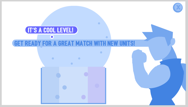
I went back to making the globe a part of the navigation. Also now we've got characters yelling flavour text, which is something I definitely want. I made the level preview bigger and closer to the navigation, because thumbnails are easier to recognize than flicking through strings of text.
Here's what's bad about this layout: Is it a menu? Where's level 1, 2 and 3? Do I go right to advance to the next option, or down? It's nice that the QUIT icon is in the top-right to better reflect the customs of software design, but how do I get there?
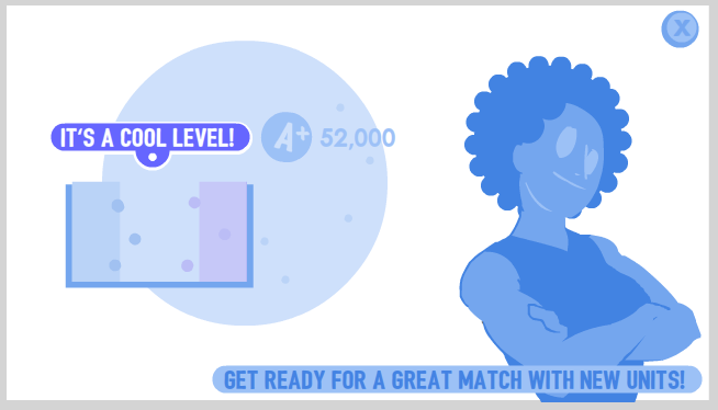
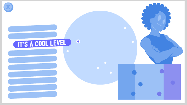
The globe takes a back seat in this iteration, and I've added a score counter to the level name. I definitely want to track your score on each level and daily challenge. The name pins to the globe-point very well, and brings those to concepts snugly together.
We're dividing the screen now between LEVEL INFO on the left, and FLAVOUR TEXT on the right. Even though the characters will give you a good impression of which units your about to face, it's quite loose and really they're just for personality and fun... so are they too big in this iteration? and is that text in the bottom-right supposed to be the charactrer talking, or the designer talking?
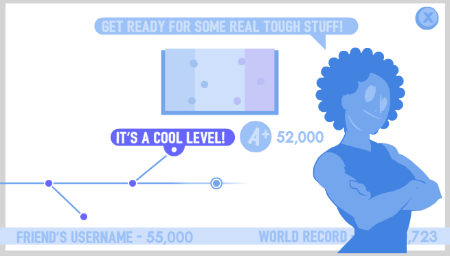
This is the final iteration I'll make for today. You can progress through these levels by flicking left and right, we can see your progress through them, which ones are optional and which ones are new, the level name, thumbnail, score and flavour text are all neatly tied together... You can see that the most important asset is in the middle of the screen, and pieces get less important as they radiate outward.
I think displaying your friends' score and world record in a news-ticker along the bottom helps it feel like it's being updated live. This is something I noticed in iterating on the awesome STREAMING NOW widget on the title screen on SpeedRunners. I hope it's not to distracting- but just distracting enough
I could even use this screen for generating a random match, daily challenge and maybe previewing online games in a lobby if I just remove the timeline!
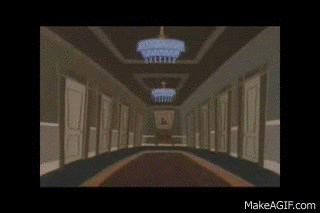
We're not navigating a globe any more, or moving around a giant Mario World map, or running around a castle jumping into paintings... but it's very functional, and I can be proud of that.
Can this expand to flick through 50+ levels? If I added an expanded level set a month later, would people find it? These are questions I'll tackle next time I have a free afternoon.Also it'd be healthy to just open a blank doc and make something completely different too.
-
Oh thanks!! Sound Effects are something I do myself and always hope I'm doing a good job.
I just knew I wanted them to sound like they physically exist, and not be sci-fi slot-machine sounds. They still need a lot more work.
The grass is very low fidelity in these videos, it looks a bit better in-game (but still not good enough). It's a black-to-white color ramp of some grass, like this:

and I just flow some particles over it telling it where to light up. The flowers are the same, except they also distort a bit and wave. You can see some experimentation with the grass here.
I'd love to do
, but I guess this is the limit of what I know how to do. Also... I do feel good that my grass is one polygon with a JPEG on it instead of a million.Here's an update: It's the very scary Thief unit!!!!
Yes, he'll steal your red team!! I just finally got the AI working on this guy, after a long time, he finally rolls just within the perfect radius to steal you. Very scary. Over-powered? In the hands of a perfect computer, maybe so!
You also see here the level select screen I implemented yesterday. I was so happy with the idea of spinning a globe around, and unlocking levels around a fictional, exciting world map-- but now that I've had a chance to sleep on it, maybe it should just be a normal menu instead :I
Oh- and many UI changes, all the time, here's an example: The balls used to turn black when they were about to blow up. That meant that you actually couldn't see which team colour was dieing. Very stupid, in hindsight. Now their "face" actually gets smaller before they blow up instead, so you can definitely see which team colour they are.
-
Very bizarre hearing Chris talk about DevGAMM.
We basically share an office with the CEO, so I've heard some news about it every day for 3 years, also listening to Idle Thumbs in that time.
It's true, there's a whole scene of talented developers in Russia, Poland, Ukraine... If you're at GDC thinking "Wow, all the developers in the world in one place!" then you're forgetting the hundreds of thousands that were declined a visa, or just can't speak English well enough to communicate with PAX or Gamescom or the Indie Megabooth.
I don't have a good explanation for why it's called "DevGAMM", but for identifying it as a game developer's conference in Russia; it does sound right.
-
Here's a funny clip of me juggling in the Steam VR demo, and very obviously dropping things.
Then I play fetch with a virtual dog.
I enjoyed playing the Steam VR example games for a bit. The catapult one is very fun, and has a lot of Portal humor and writing in it.
Am I bad at archery, or is this game not calibrated right? I will never know.
I was impressed with how well the technology works, but people can still mess with me in real-space. I can still clip a 3D cup through a 3D desk and watch it glitch around when I let go. The space we had to allocate was larger than the available space in any of our living rooms. The stuff is still too damn expensive.
The Ikea VR Experience was very promising. There are only a couple choices, to change the colours of my cabinets and walk around, but I was still excited just to do that and judge my virtual kitchen. I think Ikea should definitely put a small team on developing their kitchen viewer app.
Seeing this app was also exciting. People who don't know how to use 3D modelling software (which is arguably quite hard) can sketch out levels, prototypes, living rooms in a physical and accurate way. I always think of
, but there are probably more relevant examples out there. I wonder if the convenience will ever out-weigh the massive barrier to entry, though. -
Oh I'd actually forgotten that I had screen shake.
Here's an example of the enemy who freezes, just cos I haven't updated in a while.
-
I'm not a big fan of Extra Credits' video style, but wow this introduction to posing and animation is a great video. I really appreciate the work of breaking it all down.
Actually, for those of you looking for something a bit more advanced, This Skull Girls animation talk from GDC was really really good:
-
As far as comedy physics games, I think you should play or take a look at Poly Bridge, Besieged, Kerbal and Home Improvisation.
It might be difficult to come up with something that has real substance as a comedy piece, AND a challenging and interesting building game.
Surgeon Simulator doesn't last very long, for example, but Kerbal is funny at first because it's actually SUCH a deep system.
Try to find a strong usable identity now, in pre-production

-
Don't know about anyone else here, but I'm clicking the Download link and the Play button, and it doesn't work.
Don't worry though, cos the episode does exist here.
-
I stopped playing this game about 80% of the way through the campaign because my team was just stomping everything. So I felt like I wasn't really getting the intended experience.
Actually, now that I type it out, maybe they designed for that? Thinking I would enjoy the end of the game that way? I dunno.
I might start again on a harder difficulty or something when I have the time.
-
Actually what the heck I'll just post the older stuff here too:In this video, you can see a giant donut that whacks all units within it's radius every few seconds. Maybe you want to knock the enemy into there- but can you do it without landing there yourself?You can also see the electric pins that each team has stuck in the ground, and the red and purple teams' defense zones. If your ball is in it's defense zone, it'll take only half damage- so try to roll back there as much as you can!This video was recorded a while ago, and so doesn't have any special art or sound.
-
Hello friends!
I'm aiming to make a turn-based tactics game a bit like Advance Wars, or X-Com, but maybe easier to get into, and with shorter more fast-paced matches.
I enjoyed Hearthstone last year, and right now I'm enjoying Clash Royale.
If you can bounce your team-mate into an enemy instead of hitting them directly, they actually do almost double damage- but instead of damaging the other team to death, maybe you should capture the base in the middle like I did in this video!
I just this week put in the artwork and some sound effects, so I hope this video is self-explanatory enough. I also have a cool air-strike that hits all units finished and working, and a special ball that freezes the opponent's timer, a ball that converts all opponents around him to the other team, a ball that sits still and electrocutes anyone who comes near, etc etc. Check out my youtube channel if you're really interested.
The game is very in-development, and a lot of it can change. I'm only working on it after work, or on weekends. -
Thank you! I've been checking back at the GDC site waiting for stuff to go up.
Wow,I was excited about seeing a talk on action games from Platinum, but theirs is very boring. I will definitely check out the ones that you linked instead!
-
In-case you guys don't know, your "video-gaaaaaaames" bumper happens twice at the beginning of the show, and then once again in the middle of an ad at 31 minutes.
-
Y'know it's also possible that the Far Cry 4 and the Far Cry Primal map are the same because Ubisoft has built so many open worlds that they're designing them with the same honed, efficient process, and they designed the same shape twice.
Or maybe it's one big epic lore.
-
Wow I wrote a short review, and then noticed it was exactly the same as above!
I had a consistent crash-to-desktop when I entered a certain mission... but there was a solution on the Steam forums that helped.
I had a bit of trouble understanding how the game worked in the first couple hours. Am I spending TIME time right now? Am I earning supplies for this? Is "intel" a resource I should be spending, I don't get it??? In that part of the game, I did screw up my builds to a sad degree and started again. If your good soldiers die, it can be a downward spiral.
However, since I figured out the game's mechanics, I've lost missions and bounced back from it a couple times and really enjoyed the game.
-
I was just wondering where the whole idea for teleporting doors comes from, and of course it's obvious.
That final scramble is the world's most intense Scooby-Doo door chase.
-
On this topic I saw a funny GIF recently:
nnnooooooooo!
In watching Rick and Morty, I really enjoyed that it was animated like a Disney Channel or Nickelodeon cartoon, and not like other "adult cartoons" that make me sad. It was surprising and fun whenever a character would flip out and do something cool.
-
Monsters Inc is, I think, my favourite one of the lot too. It just feels like a brand new idea executed perfectly. Like Ghostbusters, or Star Wars or a Miyazaki film, it's a 90-minute peek into a fully realized, convincing, interesting new world. I think Monsters Inc achieves this the best, and I've grown to appreciate that it's a self-contained movie that just ends, unlike Star Wars.
I really enjoyed Toy Story 2 and agree with Patrick. The second Buzz really was great and kind of retroactively made Buzz's situation in Toy Story 1 work a bit better. The gags and the lessons learned all made sense and worked quite well throughout the whole movie. I find the scene with the old toy repairman fixing Woody especially cathartic to watch. I think generally, this movie explores what it means to be a "child's plaything" much more effectively than the first movie
Yea Toy Story 2 is an excellent example of a sequel. The characters have grown up and changed, and we're diving deeper into stuff that was touched on in the first movie. Other-Buzz an Jessie are both cool "what-if" scenarios for Buzz and Woody to think about and respond to.
-
There's something not right about this thread...
-
I'm quite happy with some of my recent SpeedRunners artwork.

This is my next draft, and I'm looking forward to getting it done:
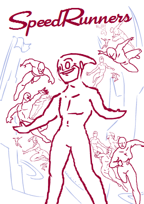
Our game is about super-heroes zipping and swinging around a metropolitan city- I'm not gonna lie about it: sometimes I just use Spider-Man poses.
-
From what I know about FIrewatch, it seems to be a game where you patrol a national park, track down misbehaving teens and yell at them.
I assume it expands to like-- more and more rambunctious teens in the later levels.
-
Is the next act the last one?
-
When Chris is talking about the Anno companion app 5 minutes in, every time he uses the word "Energy" I forget that energy is an in-game resource and just think he sounds like a deluded work-slave maximizing the potential of the actual energy in his body.
-
GIRL REACHED PLUTO
http://www.eurogamer.net/articles/2015-11-24-rejoice-noby-noby-boys-girl-has-finally-reached-pluto
#YearOfThePS3
[DevLog] Battle Snooker (Working Title)
in Game Development
Posted
This post is an accident, I deleted and then un-deleted the one above :x